22 Nursery Paint Color Ideas That Turn Any Baby Room Into a Peaceful Haven

Ever stood in a nursery and felt something click inside you? That quiet sense of calm that makes you want to stay longer. Color does that. The right paint shade can turn a plain room into a soft, nurturing world where memories start forming.
Parents search endlessly for nursery paint color ideas that feel both soothing and personal. You want warmth but also freshness, something that grows with your child. From gentle whites to earthy greens, these trending shades bring life, balance, and comfort to every baby room.
Soft Cloud White for a Calm Start
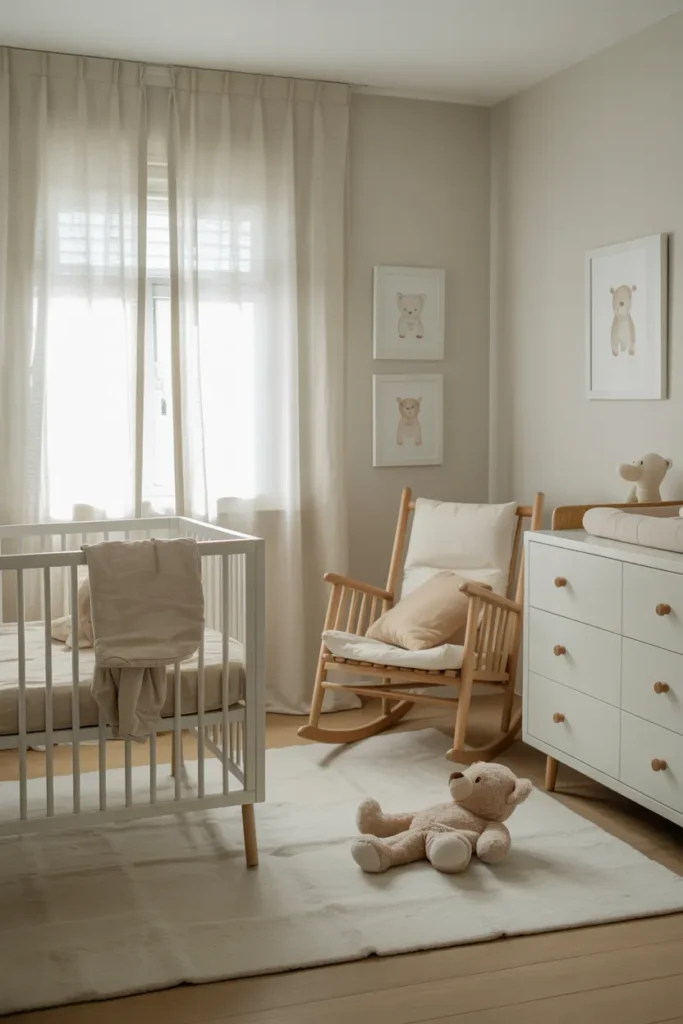
You walk into the room and it just feels peaceful. The white walls catch the sunlight in a soft, sleepy way. You pause for a second. It feels like the day itself slowed down just for you.
White works best when you want the nursery to feel fresh and open. The color spreads light across the space, making it look bigger than it is. You can match it with pale wood cribs or linen curtains. Add a few soft toys. The room starts to glow.
At night, lamp light bounces gently on the surface. It’s calm, not cold. You can change décor anytime without repainting. Cloud white always fits whether you go boho, minimalist, or modern nursery style.
Warm Honey Beige for a Cozy Touch
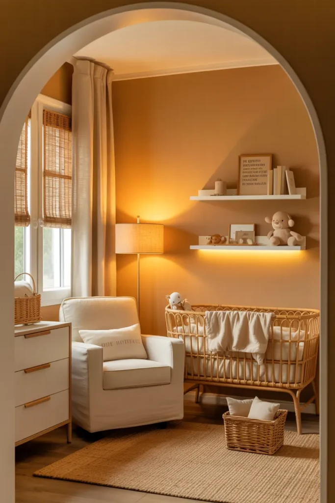
You know that golden glow that feels like sunset inside your home. That’s what honey beige gives you. It wraps the nursery in warmth. You instantly feel at ease when you step in.
The shade looks soft during the day. It holds natural light with a mellow shine. Pair it with rattan baskets, cotton curtains, or off white rugs. Everything blends easy. You don’t need much to make it work.
When the lamps come on the color deepens. It feels homey. The nursery walls look richer, more grounded. You can almost smell warm milk and baby lotion in the air. This tone suits rustic, earthy, or farmhouse nursery designs without trying too hard.
Misty Sage Green for a Fresh Start
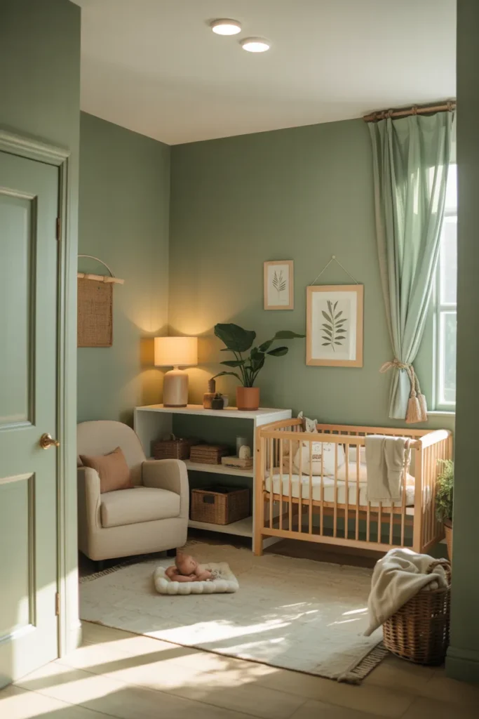
You open the door and the first thing you notice is calm. Misty sage green feels like a breath of morning air after rain. The kind of green that whispers, not shouts.
It’s soft and earthy, perfect for nature themed nurseries. The color works with light wood cribs, leafy wall art, or cotton rugs. You can even mix it with brass accents for a modern touch. It stays balanced. Always.
Evening brings out its gentle gray undertone. The nursery feels grounded yet light. Babies rest easier here. You’ll love how it grows with them too. The tone suits both newborn nurseries and toddler playrooms beautifully.
Powder Blue for a Soft Airy Feel
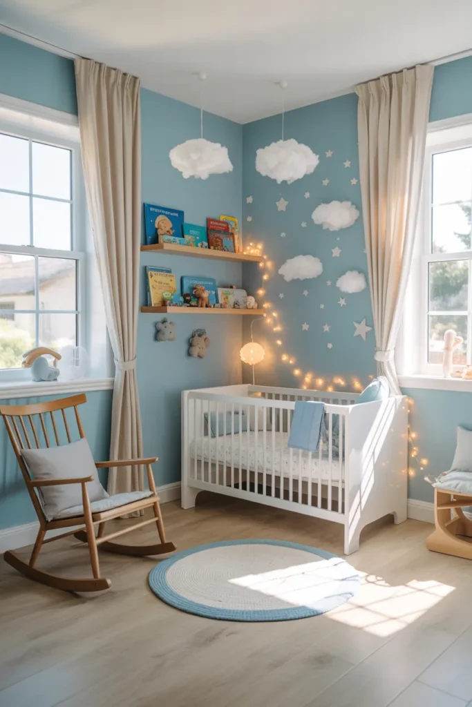
There’s something timeless about powder blue. You walk in and suddenly everything feels lighter. The walls hold a calm that’s soft but steady.
During the day the sunlight dances across the room. You see a glow that feels like sky on a quiet morning. White furniture looks clean against it. Add a cotton blanket or a knitted rug and the scene feels almost storybook.
By night the space changes. It turns cozy, close, and warm. Perfect for bedtime stories and slow breathing. Powder blue fits both classic and modern nursery palettes and it never gets old.
Blush Peach for a Sweet Gentle Glow
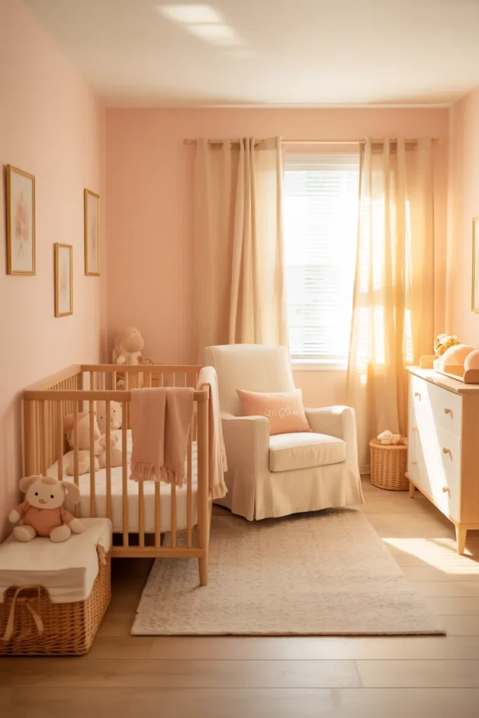
Blush peach feels tender like a lullaby in color form. You brush the last stroke on the wall and instantly smile. The nursery starts to feel alive, soft, and full of warmth.
The color brings a subtle rosy tone that looks beautiful in daylight. It pairs perfectly with creamy whites, light wood furniture, and woven baskets. You get a natural, balanced look that stays bright without feeling loud.
As evening settles blush peach turns golden under soft lamps. It feels safe. You’ll notice how the room almost hugs you back. It’s a sweet tone for modern baby rooms especially when you love gentle and timeless nursery paint ideas.
Soft Lavender for a Dreamy Whimsy Feel

You walk in and everything feels light. Lavender fills the room with quiet sweetness. It’s calm but has a playful twist that makes the space feel alive.
This color works beautifully for soft, dreamy nursery designs. It pairs well with white cribs, floral wall decals, or silvery curtains. The tone catches both daylight and lamplight in a gentle shimmer that soothes your senses.
At night the lavender deepens just a bit. It turns warm and cozy without losing that airy charm. You’ll notice how it helps your baby relax faster. It feels like bedtime magic without even trying.
Pale Mint Green for a Cool Refreshing Look
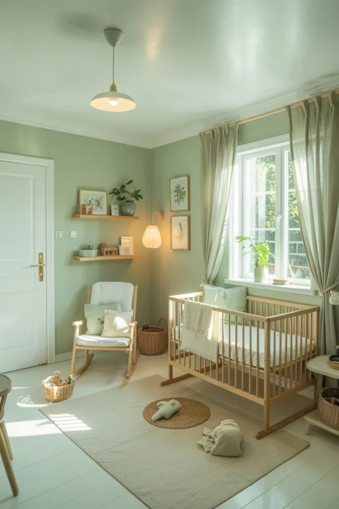
The first thing you feel is freshness. Pale mint green gives your nursery that clean and cheerful lift that feels like spring mornings. It’s soft yet full of energy.
You can mix this shade with light oak furniture and white bedding for a breezy look. It blends easily with natural textures and open windows. Everything feels calm, simple, and quietly joyful.
In the evening it softens into a cool, dreamy backdrop. The air feels lighter. You might add a few woven baskets or cotton curtains to finish that calm, organic nursery style everyone loves.
Warm Terracotta for Earthy Comfort
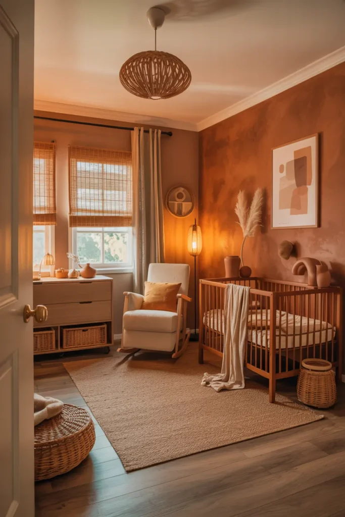
Terracotta feels like a hug you didn’t expect. You step inside and it’s cozy, grounded, and full of depth. The color carries warmth that wraps around the whole space.
You can use it on an accent wall or all over depending on your taste. Add off white trim and wicker baskets. Maybe a linen armchair for feeding time. It feels lived in but still refined.
As light shifts during the day, the tone glows differently. Morning brings a soft clay hue while evening gives it a rich sunset feel. It’s perfect for rustic or Mediterranean nursery themes that feel warm and real.
Soft Butter Yellow for a Happy Glow
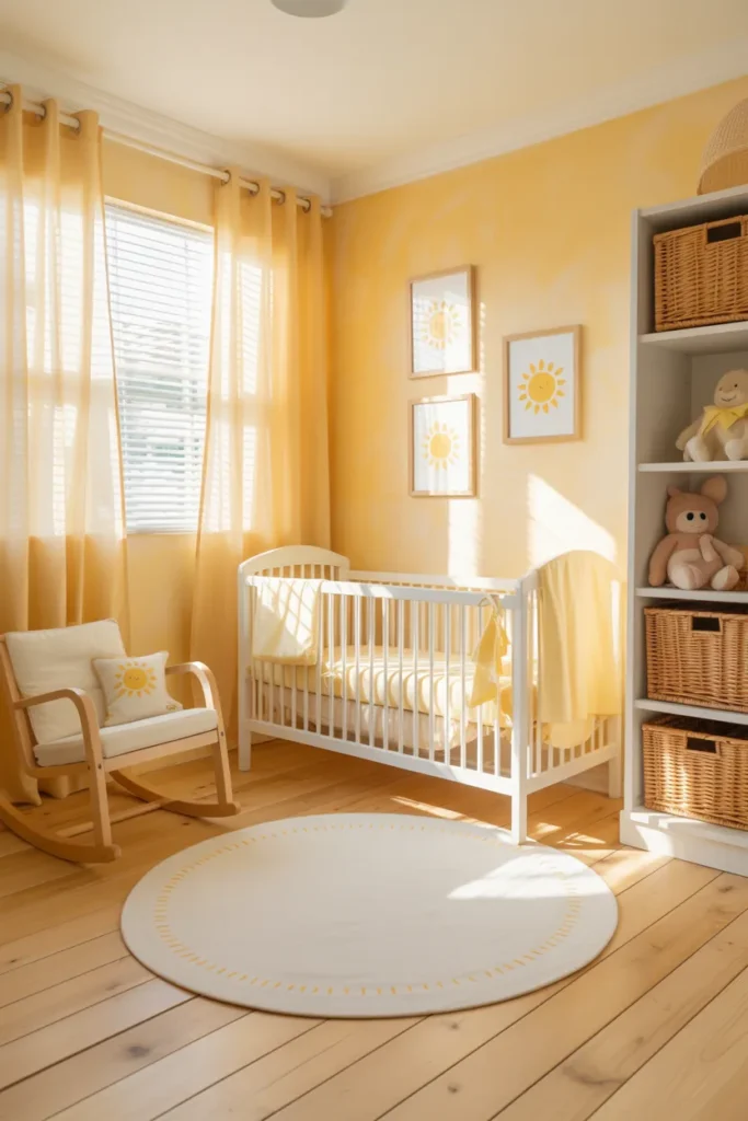
Sunshine. That’s the first word that comes to mind. Butter yellow makes your nursery glow like early morning light. It’s cheerful but never loud.
Pair it with white trim, simple wall shelves, and soft beige rugs. Add a few natural wood accents for balance. The result is a nursery that feels open, joyful, and warm all at once.
At night the tone deepens into a golden honey shade. It’s gentle and comforting for bedtime. You can almost feel the warmth even with the lights dimmed low.
Pale Taupe for a Calm Modern Look
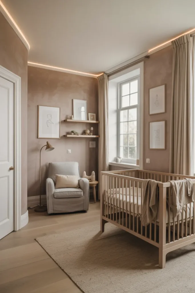
You stand in the nursery and notice how quiet it feels. Pale taupe has that kind of stillness you want at the end of a long day. It’s clean and modern yet carries a soft, lived in warmth.
This shade works perfectly in minimalist or neutral nursery designs. It matches everything from rattan cribs to white dressers. Add layers of texture with linen bedding or cotton throws. It’s simple but never plain.
When the evening light hits, taupe turns slightly deeper, creating a soft mood that feels peaceful. It’s a shade that grows gracefully as your baby grows too. Calm, timeless, and easy to love.
Muted Coral for a Playful Warm Energy

You walk in and the room smiles back. Muted coral has that soft warmth that feels both joyful and gentle. It brings color without chaos, brightness without noise.
This shade works best when you want a cheerful nursery that still feels calm. Pair it with white or sandy beige furniture and soft cotton curtains. The coral tone bounces light beautifully, giving the room a steady glow through the day.
At sunset it turns richer, almost like the sky after rain. The nursery feels full of life yet peaceful. It’s a color that keeps the energy happy, perfect for curious little minds.
Soft Mushroom Gray for a Timeless Feel
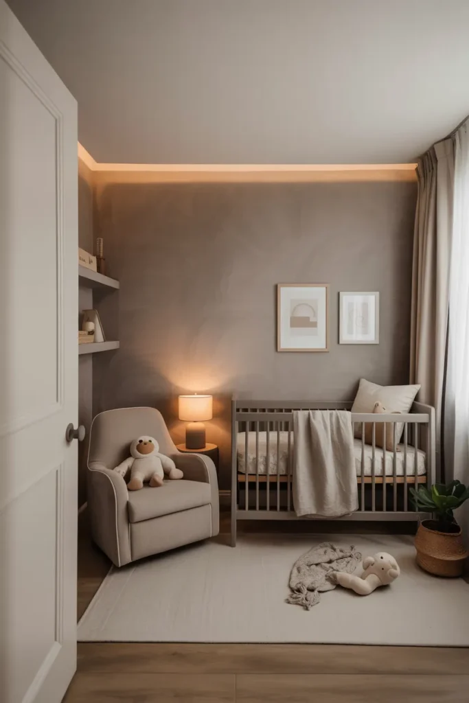
The first thing you notice is balance. Soft mushroom gray feels calm, smart, and steady. It doesn’t demand attention, but it quietly grounds everything around it.
You can match it with wooden furniture or warm ivory textiles. The tone works well in both traditional and modern nursery styles. It gives you space to play with accents pastel art, plush toys, or natural fiber rugs.
As the light changes, gray shifts from cool to cozy. The room never feels dull. It’s that perfect middle ground where peace meets polish.
Muted Sky Blue for Gentle Serenity
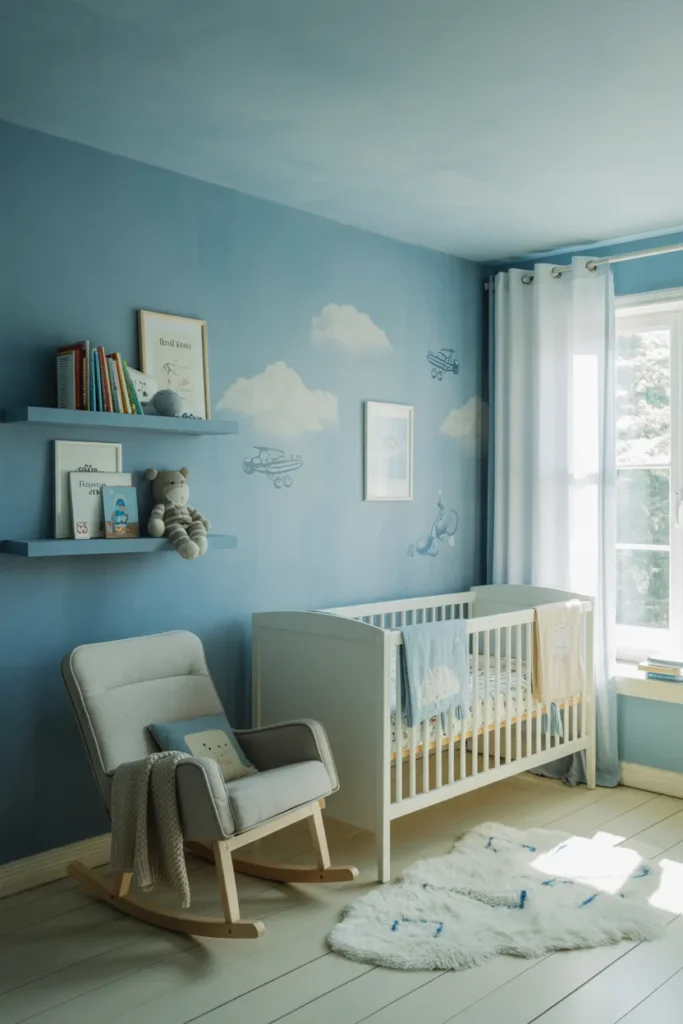
Muted sky blue carries the calm of open air. You look around and it feels like a slow morning outside. The color relaxes your mind before you even sit down.
This shade looks beautiful with white trim and natural wood. It makes the nursery look fresh without being too bright. You can add linen bedding or a few woven baskets for a soft textured touch.
In the evening it turns mellow, almost hazy. The walls seem to breathe with the light. It’s a shade that makes quiet moments last longer.
Dusty Rose for Vintage Charm
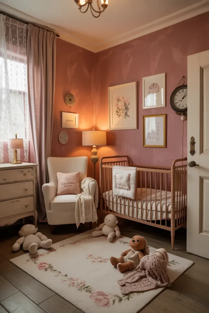
You touch the wall and smile. Dusty rose feels nostalgic, like an old photograph that still holds warmth. It’s romantic without being overly sweet.
Pair it with brass frames, lace curtains, or antique inspired furniture for a timeless nursery setting. The tone works beautifully with off white and light brown details. It makes every piece in the room feel intentional.
As night falls, the shade deepens, catching lamplight in the softest way. The space feels tender and slow. It’s perfect for parents who love a little vintage soul in their baby room.
Creamy Oatmeal for a Soft Organic Look
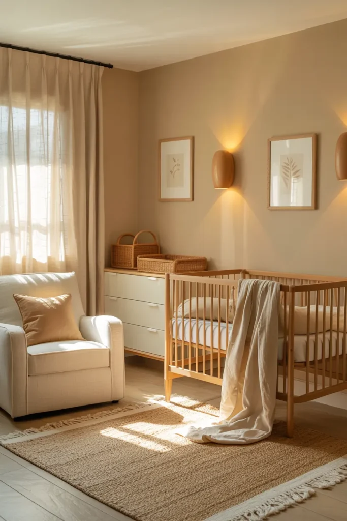
The room feels gentle from the first step. Creamy oatmeal brings warmth that’s soft and grounding. It’s the color of natural cotton and morning coffee with milk.
You can pair it with jute rugs, wooden shelves, and linen bedding to create an organic nursery design. Everything feels warm and real, no matter the light. It’s soothing to the eye and easy to decorate around.
At night the shade glows under soft bulbs, turning golden near the corners. The whole space feels wrapped in calm energy. It’s the kind of color that makes you exhale and smile without noticing.
Pale Sand for a Soft Natural Warmth
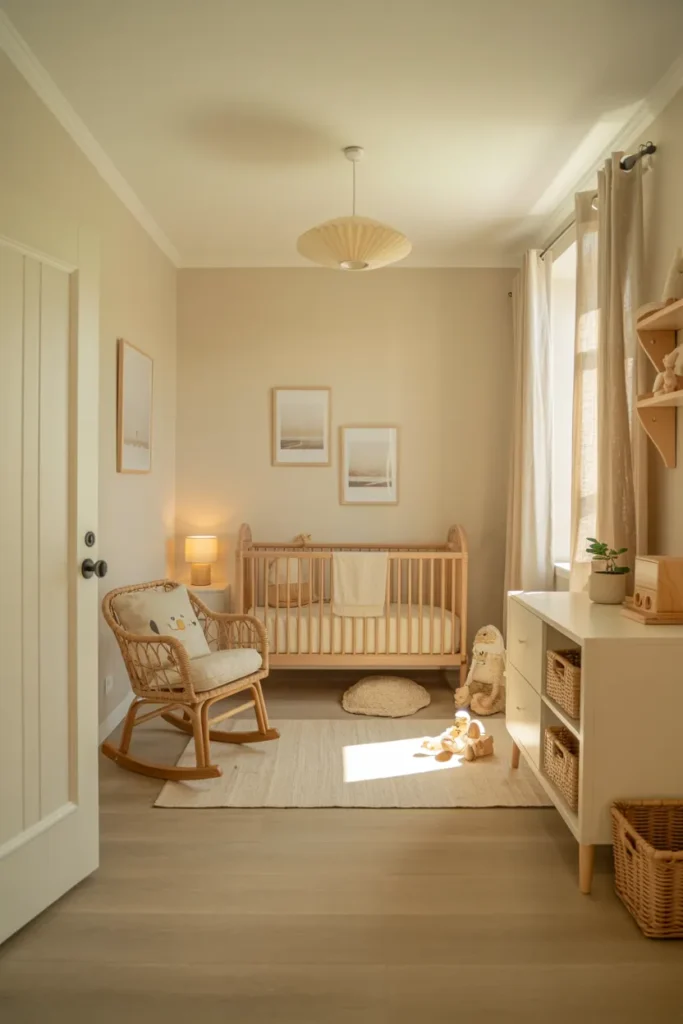
The room feels calm before you even set the crib. Pale sand has that quiet warmth of morning light on beach stones. It’s soft, airy, and easy on the eyes.
You can pair it with white or oak furniture to keep things natural. Add a woven rug and linen curtains to bring gentle texture. It’s a color that feels grounded yet never heavy.
When night comes the walls glow softly under warm lamps. Everything feels slower, easier. You’ll love how this shade brings a sense of stillness that helps everyone breathe deeper.
Muted Clay Pink for Gentle Earthy Charm
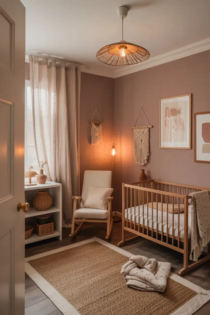
Muted clay pink feels like soft clay between your fingers. It’s warm and a little rustic but still tender enough for a nursery. The walls seem to hold a quiet pulse of warmth.
This shade blends beautifully with rattan furniture and cream textiles. You can add handmade art or macrame decor to create a cozy boho baby room. The color feels natural, not polished, which gives the space character.
Even in low light, clay pink glows. It’s subtle but full of personality. A tone that makes you want to stay a little longer, rocking slowly in a chair near the window.
Pale Sky Gray for Modern Simplicity
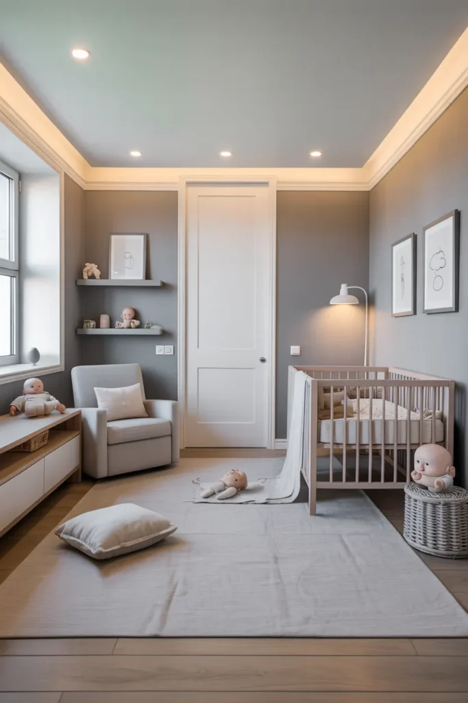
You walk in and everything feels easy. Pale sky gray gives your nursery a clean, balanced energy. It’s simple but not cold. Just calm, steady, and quietly elegant.
It works with everything white cribs, soft toys, wood shelving. The tone lets color accents stand out without fighting them. You can shift themes anytime, from modern minimalist to soft Scandinavian style.
As the day fades, gray turns slightly misty, catching shadows in a lovely way. It’s the kind of shade that stays timeless. You’ll never get tired of looking at it.
Dusty Olive for an Earth Grounded Mood
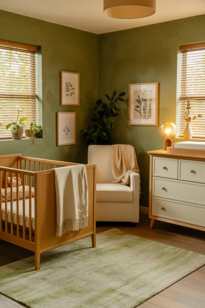
The first thing you feel is peace. Dusty olive sits right between green and brown, giving your nursery a natural, grounded feeling. It reminds you of soft forest walks after rain.
It pairs well with neutral textiles, wooden furniture, and cream accents. The mix feels organic, clean, and safe. Even a small space feels connected to nature with this tone.
At night it turns deeper, more soulful. You get that sense of quiet you only find outdoors. It’s beautiful for parents who want a calm, earth rooted baby room.
Warm Vanilla Cream for a Timeless Glow

Vanilla cream is the color of calm mornings and soft blankets. It gives your nursery a light, gentle warmth that never feels too much. The space feels instantly welcoming.
It matches everything white, gold, beige, even pastel decor. You can add layers with cotton fabrics and knitted textures. The color reflects soft light and makes the room glow naturally.
When lamps come on, it turns golden like candlelight. The air feels still and soothing. It’s perfect for parents who want a cozy, timeless nursery without overthinking the palette.
Seafoam Blue Green for Breezy Calm
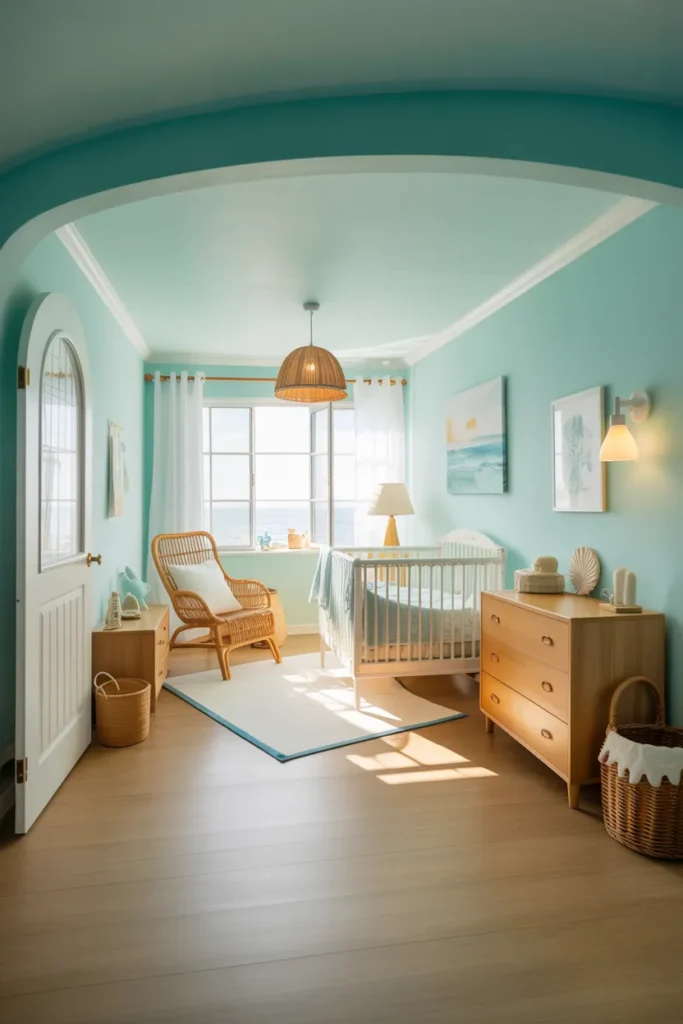
Seafoam feels like ocean air moving through the room. It’s gentle, a little playful, and full of easy energy. You instantly feel lighter surrounded by it.
Pair it with white furniture, rattan baskets, or woven rugs for that fresh coastal nursery look. It works beautifully in both bright and dim light. The color carries a clean, natural mood that stays refreshing year round.
At night the tone cools slightly, wrapping the room in a soft, breezy calm. It’s perfect for parents who want something peaceful but not plain.
Soft Mocha Beige for Warm Modern Balance
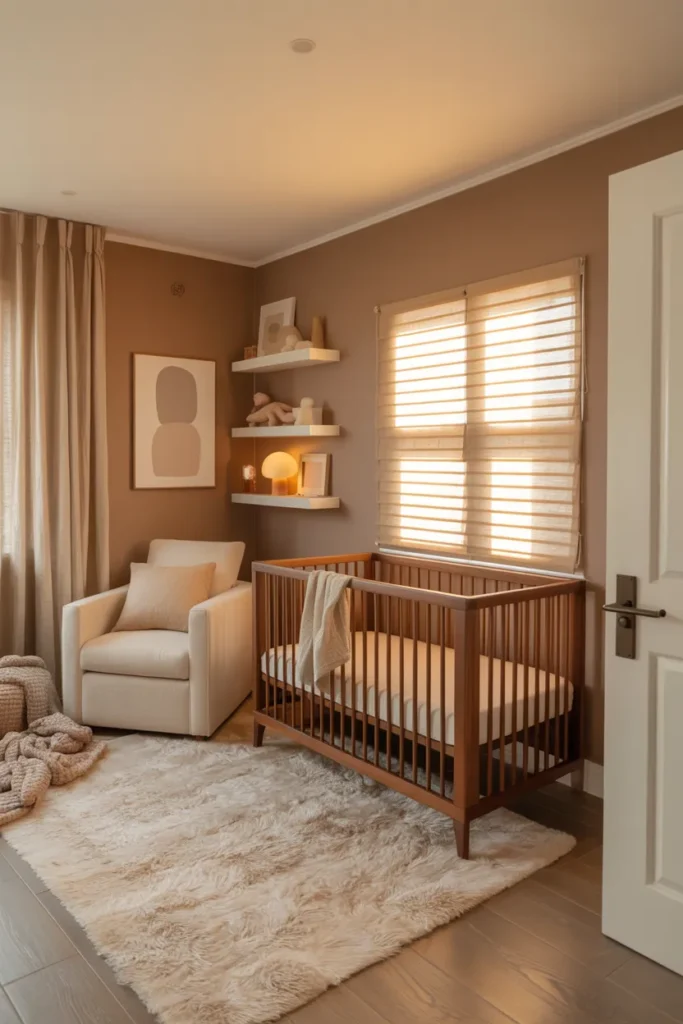
Soft mocha beige gives your nursery a sense of comfort the second you step in. It’s warm, modern, and quietly elegant. The color feels cozy without ever feeling heavy.
You can match it with white or walnut furniture, cotton fabrics, and gold framed art. The tone blends easily with neutral nursery decor or gender neutral palettes. It gives a subtle richness that lasts beyond the baby years.
In the evening, the walls seem to hold light instead of reflecting it. The room feels slow, warm, and safe. It’s a shade that never goes out of style and always feels like home.
Conclusion
Colors shape how a nursery feels long before furniture or decor arrive. Every shade you pick sets a mood soft cloud whites calm, terracottas warm, and sage greens breathe life. Each tone in these nursery paint color ideas helps you design not just a space but a feeling of belonging.
Now is the moment to open that paint can and start creating your little one’s world. Explore your palette, trust your instincts, and build a nursery that speaks love in color.
