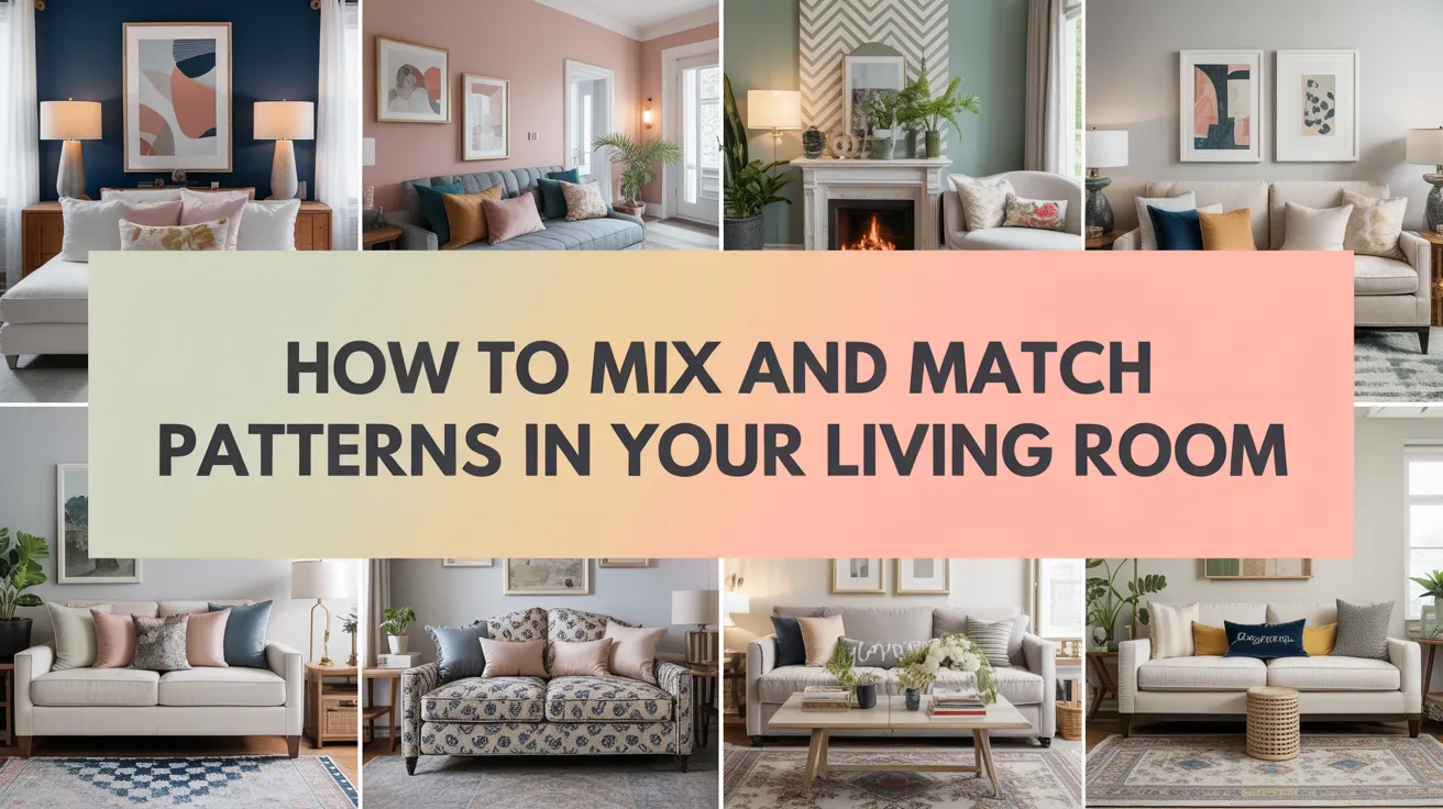
How to Mix and Match Patterns in Your Living Room Like a Designer

Have you ever stood in your living room, clutching a floral pillow in one hand and a striped throw in the other, feeling completely paralyzed? You see these beautifully layered, pattern rich rooms in magazines and on Pinterest, but when you try to recreate the look, it feels more like a chaotic jumble than a curated masterpiece. If that sounds familiar, trust me, you are not alone.
I remember the first time I tried to get adventurous with patterns. I’d just moved into a new apartment and was determined to make my living room look like it was straight out of a high end design catalog.
I bought geometric curtains, a chevron rug, and a collection of botanical print cushions. The result? A visual headache. It was a classic case of enthusiasm trumping strategy, and it taught me a valuable lesson: mixing patterns is an art, but it’s one with rules that anyone can learn.
So, let’s chat about it. Think of me as your design obsessed friend who’s already made all the mistakes so you don’t have to. Together, we’ll go through the simple principles that designers use to create those effortlessly chic spaces.
By the end of this, you’ll know exactly how to mix and match patterns in your living room like a designer, creating a space that’s full of personality, depth, and style.
The Foundation: Understanding the Rules of Pattern Play
Before we start throwing pillows around, it’s crucial to understand the basic theory behind successful pattern mixing. It’s not about random chance; it’s about creating a balanced and cohesive look. The three main pillars to remember are scale, color, and number. Getting these right is 90% of the battle.
The Magic Number: The Rule of Three
When you first start to mix and match patterns, a great guideline to follow is the Rule of Three. This means choosing three different patterns to work with in your space. Why three? It’s just enough to create interest and complexity without overwhelming the eye. You can always add more later as you get more confident, but three is the perfect starting point.
Your three patterns should ideally fall into these categories:
- A large scale pattern: This is your lead or “hero” print. It’s the boldest and will likely be the first thing that catches the eye.
- A medium-scale pattern: This pattern should be about half the size of your lead print. It complements the main pattern without competing with it.
- A small scale pattern: This is your detail print. It’s subtle and adds texture and depth from up close. It could be a simple pinstripe, a small dot, or a tight geometric.
Think of it like casting characters in a play. You have your leading actor (large pattern), a supporting actor (medium pattern), and a background extra who adds to the scene’s richness (small pattern). They all have a role to play, and together they tell a complete story.

Scale is Everything
The most common mistake people make is choosing patterns that are all the same size. When you have two medium-sized floral prints right next to each other, they fight for attention, and the result is visual noise. The key to harmony is varying the scale dramatically.
Your large-scale pattern needs room to breathe. This might be on your curtains, an area rug, or a statement armchair. Your medium-scale pattern can live on accent chairs or throw pillows, and your small-scale pattern is perfect for smaller items like lumbar pillows, lampshades, or even decorative boxes. This distribution helps the eye travel around the room, taking in each element without feeling overwhelmed.
H3: How to Judge Scale
- Large: A pattern where the repeating element is bigger than your fist. Think big, bold florals, wide stripes, or oversized damask.
- Medium: The repeating element is roughly the size of your palm. This includes classic patterns like plaids, chevrons, or animal prints like leopard.
- Small: A pattern where the repeat is very small, often just a few inches or less. Polka dots, pinstripes, and tiny geometrics fit here.
Building Your Color Palette
Once you have a handle on scale, the next step is unifying your chosen patterns with a cohesive color palette. This is what ties everything together and makes your eclectic mix look intentional and sophisticated. You can’t just grab three patterns you love; they need to share a common color thread.
Choose Your Color Story
The easiest way to ensure your patterns work together is to select a color palette of two to three main colors and then sprinkle in one or two accent shades. For example, your palette could be navy blue, white, and a touch of mustard yellow.
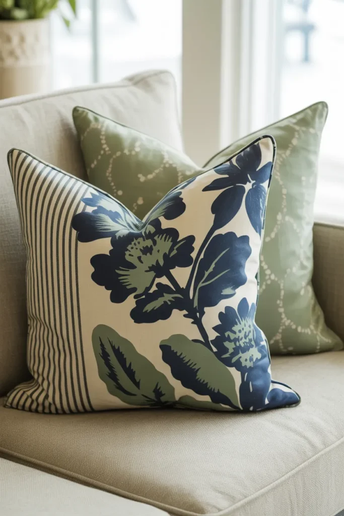
Once you have your colors, make sure each of your three patterns contains at least one of them. Your large-scale floral print might feature navy, white, and green. Your medium-scale stripe could be navy and white. Your small-scale geometric might be mustard yellow and white. The shared colors—in this case, navy and white—act as a bridge between the different patterns, creating a sense of unity.
The 60-30-10 Rule
This is a classic interior design rule that works wonders for creating a balanced living room. It’s simple:
- 60% of your room should be a dominant color. This is usually your wall color, large furniture pieces like your sofa, and maybe your main rug. It’s the backdrop of your space.
- 30% should be a secondary color. This is where some of your patterns can come in! Think accent chairs, curtains, and larger pillows.
- 10% should be your accent color. This is for your boldest, most vibrant hue. Use it on small throw pillows, artwork, and decorative objects. This is where your small-scale, high-impact patterns can really shine.
This formula ensures that the colors are distributed in a way that’s pleasing to the eye. It gives the space a foundation while allowing for pops of personality. IMO, it’s a foolproof method for anyone nervous about color.
Let’s Get Practical: A Step-by-Step Guide to Mixing Patterns
Okay, theory is great, but how do you actually apply this to your living room? Let’s walk through the process step by step, from choosing your first pattern to placing the final pillow.
Step 1: Find Your “Hero” Pattern
Every great patterned room starts with one fabric that you absolutely love. This is your hero pattern, and it will serve as the foundation for all your other choices. Don’t overthink it; just find a pattern that makes your heart sing. This will most likely be your large scale pattern.
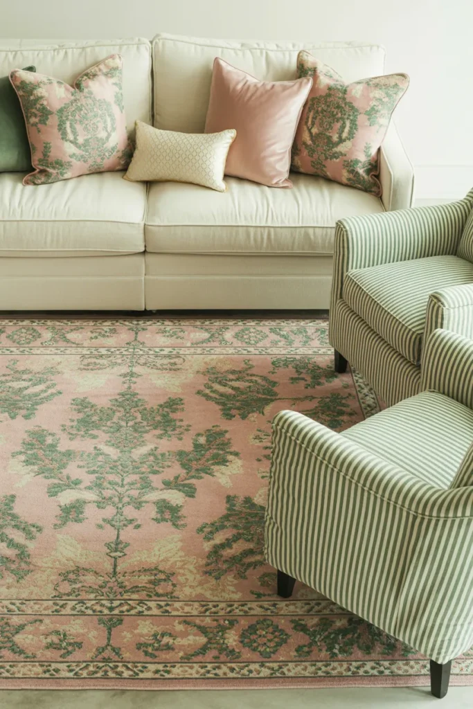
This print could be on anything: a rug you found at a flea market, fabric for new curtains, or a piece of art. Once you have it, pull your color palette directly from it. For example, if you fall in love with a floral rug that has shades of blush pink, forest green, cream, and a hint of gold, then that’s your palette!
Step 2: Choose Your Supporting Patterns
Now that you have your hero and your color palette, it’s time to find your medium and small scale patterns. Go back to your palette (blush, green, cream, gold) and look for patterns that incorporate these colors.
- Your medium-scale pattern could be a classic stripe or a plaid in cream and forest green. The style is different from your floral hero, but the shared colors make them feel connected.
- Your small-scale pattern could be a subtle blush pink and cream dot print or a simple gold geometric on a lumbar pillow. It adds that final layer of detail without competing.
Pro-Tip: A great way to ensure variety is to mix different types of patterns. Combine a floral (organic) with a geometric (structured) and a stripe (linear). This contrast in style is just as important as the contrast in scale.
Step 3: Distribute Your Patterns
Now for the fun part: placing everything in your living room. Remember to spread the love! Don’t clump all your patterns together on the sofa. A balanced room will have patterns distributed at different heights and locations.
Here’s a sample distribution:
- Large-scale hero pattern: Area rug or curtains.
- Medium-scale pattern: A pair of armchairs or a few large sofa pillows.
- Small-scale pattern: Small accent pillows, a lampshade, or a throw blanket draped over a chair.
This creates visual balance and encourages the eye to move around the space. Also, don’t forget to incorporate solids! Solid colored pillows, throws, and furniture are essential for giving the eye a place to rest. They break up the patterns and prevent the room from feeling too busy. Imagine placing a solid forest green pillow between your floral and striped cushions it acts as a calming buffer.

Advanced Techniques for the Brave
Feeling confident? If you’ve mastered the basics, you might be ready to try some more advanced designer tricks. These techniques can add an extra layer of polish and personality to your living room.
Mixing More Than Three Patterns
The Rule of Three is a guideline, not a law. Many designer rooms successfully incorporate five, six, or even more patterns. The key to making this work is to stick rigidly to your color palette and ensure you have a wide variety of scales.
If you’re using five patterns, you might have one large, two medium, and two small. For example:
- Large: Oversized floral (on curtains)
- Medium #1: Leopard print (on an ottoman)
- Medium #2: Plaid (on pillows)
- Small #1: Pinstripe (on a lampshade)
- Small #2: Tiny geometric (on a different pillow)
As long as they all share a common color story (e.g., black, camel, and cream), the mix will feel cohesive rather than chaotic.
The Power of Black and White
Wondering how to add a pattern that doesn’t quite fit your color scheme? Try one in black and white. A classic black and white stripe, check, or animal print can act as a neutral in a room full of color. It has the amazing ability to ground other patterns and add a graphic punch without clashing.
For example, in a room filled with blue and white florals and geometrics, a black and white striped pillow can add a touch of modern sophistication. It’s an unexpected twist that feels instantly chic. FYI, this is a secret weapon for many designers!
Playing with Texture
Texture is a pattern’s quiet cousin. A chunky knit throw, a velvet pillow, a woven basket, or a linen curtain all have a tactile quality that functions like a subtle pattern. When you’re mixing prints, don’t forget to mix in a variety of textures too.
Placing a smooth silk pillow next to a nubby boucle one creates interest even if they are both solid colors. This textural play adds warmth and depth, making your living room feel cozy and inviting. It’s a sensory layer that takes a room from “decorated” to “designed.”
Tying It All Together
So, there you have it. The secret to how to mix and match patterns in your living room like a designer isn’t some mystical gift it’s a formula. It’s about balancing scale, sticking to a color story, and distributing your chosen patterns thoughtfully throughout the space.
Let’s quickly recap the golden rules:
- Start with the Rule of Three: one large, one medium, and one small-scale pattern.
- Establish a tight color palette drawn from your favorite “hero” print.
- Vary the scale of your patterns to avoid visual competition.
- Mix different types of prints, like florals with geometrics, for more interest.
- Don’t forget solids! Use them to give the eye a place to rest.
- Spread the patterns around the room for a balanced look.
The most important rule? Have fun with it! Your home should be a reflection of you. Don’t be afraid to experiment and trust your gut. If you love a combination, then it’s the right one for you. Start with a few pillows, see how it feels, and build from there.
I still have that disastrous chevron rug from my first apartment rolled up in storage. It serves as a humorous reminder that design is a journey, not a destination. So go ahead, grab that floral pillow and that striped throw. This time, you know exactly what to do. Happy decorating!
